Performance Profiler
A performance profiler panel addon for Storybook — real-time FPS, INP, CLS, memory and more. Works with all Storybook frameworks.
storybook-addon-profiler




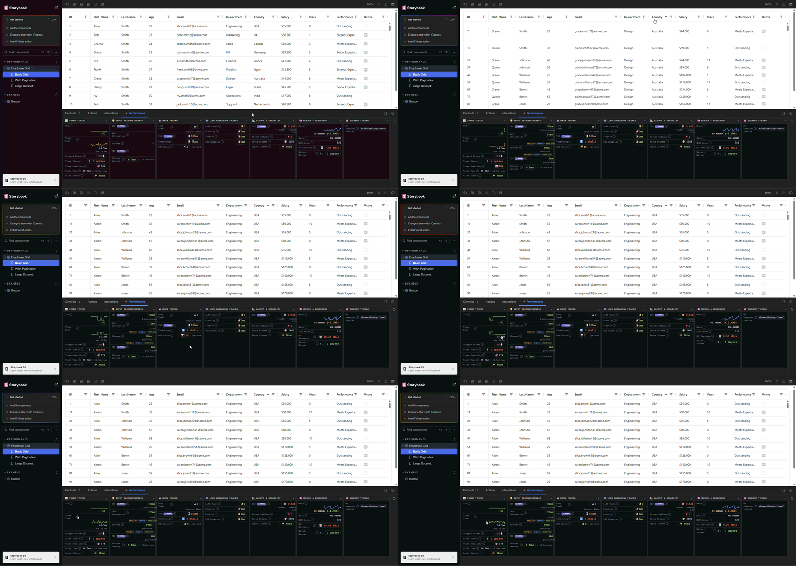
Real-time browser performance metrics inside your Storybook panel. Works with every Storybook framework: React, Vue, Angular, Svelte, Preact, HTML, web-components, and Solid.
Install
npm install -D storybook-addon-profiler
# or
bun add -D storybook-addon-profiler
Register in .storybook/main.ts:
const config = {
  addons: ["storybook-addon-profiler"]
}
export default config
That's it. The ⚡ Performance panel appears automatically and decorates every story.
What you get
The panel updates every 50 ms while a story is active. Metrics are grouped into collapsible sections:
| Section | Metrics |
|---|---|
| Frame & Paint | FPS, frame time, dropped frames, frame jitter, stability, paint time |
| Input & Responsiveness | INP, FID, pointer latency, per-interaction timing breakdown (wait / JS / paint) |
| Main Thread | Long Tasks, Total Blocking Time (TBT), DOM thrashing, mutation churn |
| Long Animation Frames | LoAF count, total blocking duration, P95, top script attribution (Chrome 123+) |
| Layout & Stability | CLS, forced reflows, style writes, CSS variable mutations |
| Memory & Rendering | JS heap, heap delta, GC pressure, DOM nodes, compositor layers (Chromium) |
| Element Timing | Per-element time-to-DOM for elements marked data-profiler="..." |
Values are color-coded against Web Vitals thresholds (green / amber / red) so slow paths are immediately visible.
Inspect
Click the 🔍 button next to any slow interaction target to flash-highlight the element in the preview iframe.
Reset
Hit the reset button in the panel toolbar to clear all collector baselines mid-story without reloading.
Element Timing (opt-in)
Add the data-profiler attribute to any element you want to track individually:
<img data-profiler="hero-image" src="..." />
<div data-profiler="above-fold-content">...</div>
In React/TSX stories the attribute is valid JSX out of the box:
<img data-profiler="hero-image" src={heroSrc} />
<MyComponent data-profiler="my-component" />
The Element Timing section lists each element's time from story render start to DOM insertion, sorted slowest first. Deduplication is by name; only the first appearance of each name is recorded per render.
Manual decorator
The preset applies withPerformanceMonitor globally. To apply it to a single story file instead:
import { withPerformanceMonitor } from "storybook-addon-profiler/decorator"

export default {
  title: "MyComponent",
  decorators: [withPerformanceMonitor]
}
Browser compatibility
| Feature | Chrome | Edge | Brave | Firefox | Safari |
|---|---|---|---|---|---|
| Core metrics (FPS, TBT, CLS, INP) | ✅ | ✅ | ✅ | ✅ | ✅ |
| Long Animation Frames | ✅ (123+) | ✅ (123+) | ✅ (123+) | ❌ | ❌ |
| JS heap memory | ✅ | ✅ | ✅ | ❌ | ❌ |
| Element Timing | ✅ | ✅ | ✅ | ❌ | ❌ |
All collectors degrade gracefully; unsupported metrics show a "not available" badge rather than erroring.
Supported Storybook frameworks
react · vue3 · angular · svelte · preact · html · web-components · solid
Requires Storybook 8+.
Architecture
See ARCHITECTURE.md for a full breakdown of the collector system, channel protocol, and manager panel.
Development
The repo ships a dev container (Node 24 LTS + Bun) that installs dependencies and builds the addon on create, and forwards the Storybook ports:
| Command | Port |
|---|---|
bun run storybook:react |
6006 |
bun run storybook:vue |
6007 |
bun run storybook:angular |
6008 |
Open the folder in a dev container ("Dev Containers: Reopen in Container" in VS Code, or devcontainer up --workspace-folder .), then run any of the above. Re-run bun run build after editing src/, since the test Storybooks load the built dist/preset.js.
Working without the dev container needs Node 24.15+ (an @angular/cli requirement) and two installs — bun install, then bun run install:angular. The Angular test Storybook keeps its own dependency tree because Angular's compiler requires TypeScript 6.x while the addon builds on TypeScript 7; see .devcontainer/README.md.
License
Apache 2.0. See LICENSE for details.
- sethcarney
